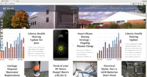
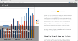
After 3 years with its original look, RV Nerds now has a new look. It is easier to see multiple posts at a glance on the front page, with shorter snippets and more prominent photos. It’s also set up for better viewing on high-resolution displays, with a side-by-side format when the viewing window is wide enough. As a bonus, it loads faster and requires fewer resources to load.
What do you think?
Front Page
The new front page is a responsive format, and adapts the number of columns to match the resolution of the device you’re using. The top photo is displayed randomly, from among several I consider my favorites.

Reading View
When you view a post, the format changes a little more dramatically depending on how you view it. With a larger window, the featured image takes over the left half of the window. This keeps paragraphs a reasonable width, hopefully making them easier to read.

If you have a smaller device, or even just a smaller browser window open, it reverts to a single column. Just as you wouldn’t want a single-column print newspaper, you also don’t want columns so narrow that every word gets hyphenated. The featured image moves to the top, with title and content right below.

Your thoughts?
Of course, this upgrade was intended to make it easier for you, the reader. If this is a first visit, great! Hopefully you find something that interests you, and we see you back again soon. If you visit regularly, let us know what you like or don’t like about the changes. If anything doesn’t seem to work quite right, or you can’t find what you’re looking for, let us know.
As always, if you have an idea for a future topic, speak up!